The work of most architects is known only by the end result. Whether brick and mortar or steel and glass, designers don’t typically stand at the main entry explaining to passersby the concept, diagram, or the many painful decisions that were involved. However, most buildings have a story to tell, of last minute changes and dozens of tough decisions. For this post we decided to look at a recently completed project and highlight a few of these critical crossroads, the final decisions, and our take away lessons.
Cascades Academy of Central Oregon is a 40,000sf Pre-K through 12th grade private school located in Bend, Oregon. The design is characterized by open courtyards, large roof overhangs and vertical cedar siding. These respond to the local climate and help to blend the building into its forested site – reinforcing the school’s focus on experiential learning. Completed in fall 2013, the building has received multiple awards, including a 2014 Wood Works US Wood Design Award and a 2013 Portland AIA Built Citation. While great achievements, none of these compare to the most important; the gratitude, appreciation and excitement of the students, teachers, faculty, and parents who interact with the building daily. This success was a credit to a great client, an open-minded contractor, and the efforts of the design team, who throughout the process resolved hundreds (maybe thousands) small but significant details, which cumulatively helped make the difference between a good building and a great building. Let’s take a closer look at a few of these.
The Impact of Color
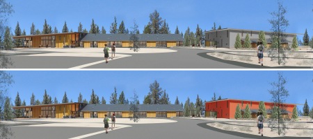
The Gymnasium for the project was designed as a separate structure. A large stucco building, the exterior finish and playful arrangement of vertical windows allow this very different structure to relate to the main building. However, as a significant, stand-alone element, there was debate on how to deal with its color:
Distinct Element: The Gym is a bright color, similar to some red barns found in Central Oregon.
Consistent Composition: The Gym is more neutral, similar to treatment of stucco at main building.
Decision & Takeaway:
After color studies, it was clear that integrating the gym as part of a consistent composition with more muted color was best.
- Strive for Simplicity: The simple material palette allowed the forested site remain the feature and the building to blend into the landscape.
- Prioritize Design Elements: Due to the scale of the gym, a bright, or contrasting color would de-emphasize the main building.
- Make an Objective Decision: Rich integral stucco topcoat colors have a cost premium and tend to fade over time.

Don’t Overthink
The roof overhangs are very prominent in the design. At up to 21 feet, they emphasize the entry, visually connect interior and exterior, and provide protection from winter snow and intense summer sun. As the project developed the design team began to rethink how these overhangs were treated:
Roof as an Object: All roof surfaces and soffits have a similar finish.
Soffit as a Surface: The exterior soffits are an extension of the interior ceilings.
Decision & Takeaway:
After rethinking this element, the team went back to the initial concept of white soffits. This emphasizes the connection between interior and exterior and matches the interior ceilings.
- Revisit Initial Concepts: These can often answer very subjective questions. In this case the indoor-outdoor connection was critical.
- Be Deliberate with Emphasis: While initially white seemed ‘loud’ as a color, it actually helped emphasize the warm cedar siding.
- Consider The Human Factor: The white roof overhangs of add a level of brightness and make the roof feel lighter and “float” above.
- When in Doubt, Do Field Mockups: On site color mockups were critical in making this decision
The entry is clearly defined and well protected.
If it’s Broke, Fix it.
The main building entrance is located between distinct wings – the Commons and the Administrative – each with a distinct roof. The design team struggled with this element, and it never quite seemed to work. As the design developed, the team realized it needed another look:
Added Element: A separate entry canopy structure leads to the main entry.
Integrated Approach: The roof is extended to shelter the outdoor entry space.
Decision & Takeaway:
The larger, integrated roof overhang shelters the outdoor entry space, creates a vaulted and daylit interior, and makes the main entry more prominent. Not the original design, this developed following an all-office pin-up.
- First Instinct Isn’t Always Right: Sometimes elements need a second look, especially as designs develop.
- Collaborate Off-Team: A point of emphasis at Hennebery Eddy Architects, the input of others in the office was critical in getting this one right.
- Build Models: A physical cardboard study model can help make quick decisions about the “pitched ideas”.
If any or all of these went the opposite way, the building would likely still be successful, but by stepping back and working through these decisions the design became more cohesive and we think the results speak for themselves.
Like what you see here? Check out more of Cascades Academy on ArchDaily.


